New and Improved Course User Experience
Our Microsoft Office courses has been technically upgraded and freshly redesigned with a new user interface, which uses modern frameworks and includes improvements for barrier-free learning. Learners can now use simple click paths in our courses for a better user experience. In addition, content display has been optimized for mobile devices, offering different view options to meet learner preferences.
The usability improvements have been applied in our courses to the start page and chapter pages; the high-level pages in our courses, which display content structure and entry points into lessons or tests.
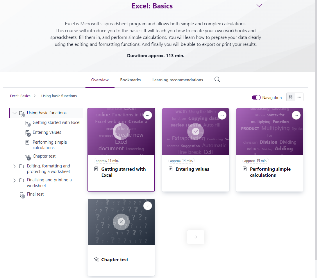
For example, the new look of a chapter page in our Excel Basics course:

Here is an overview of the new user interface improvements:
- More modern design and improved usability
- Optimized display for mobile devices
- Improved navigation through course structure, including keyboard actions
- Display course description and estimated learning time prominently
- Tests generate learning recommendations based on incorrectly answered questions
- PDF with complete course content available
- The new course user interface can be operated using a keyboard
- New help menu for support when needed
Our full range of Microsoft 365 and Office 2016/2019 courses have been updated with the new user interface improvements.
For more information about our learning content please contact E-Learning Office. Alternatively you may send us a quotation request.

